Mystery Meal – UI Comps

Recently I have been working on updating my comps for the Mystery Meal iPad application. For this design, I tried to use the size of the iPad to my advantage. The large screen size of the iPad makes it so a lot of information can be put onto each screen. Finding a way to use this space wisely is probably the most difficult part of designing for iPads. There are some apps that would work better on smaller screens, like iPhones, and some that work better on larger tablet screens.

For this app, I was once again going for the flat design. Other than the background, which is a textured light green color, the rest is all flat colors. I chose orange, green, and black as the main colors because I think they all compliment each other well. Orange and green also relate to food, so I thought they would be appropriate colors to add into the design.

One challenge I faced was determining how to make the transitions on each page work. At first, I just had an orange line running through the middle that separated each section. However, for the app I was trying to make, this did not necessarily work. I got rid of the line and instead made a section header that was smaller than the main one on the page. This way, the user can tell that each section is different, but they also know which part of the page is the main section.

Check out my UI comps below!

Make My Meal Persona #2

I decided to create another persona for my Make My Meal (working title) app that I have been creating for the iPad.

As opposed to my first persona, this one will be of an older woman with children. I decided to go this route with the second persona because the first one was a younger college male, who lives a busy college lifestyle and likes to make his own meals and eat healthy. This persona will be vastly different from the first, in that she is an older female who has children, works at home, and cooks meals for her family every night. This would be a totally different user than the first because she has to make different meal choices since she has a family to cook for. She also has less time and say in what will be cooked, seeing as though she is cooking for an entire family, not just herself.

I think she would still be a user of an app that creates meals based on food on hand because anyone who has to cook for an entire family would like something that makes their job easier. This app would probably take away the need to make a grocery store run every day or two, and instead just give the person ideas as to what to make based on what ingredients are already laying around the house.

Please check out my second persona below!

Make My Meal Persona 2

Make My Meal Persona 2

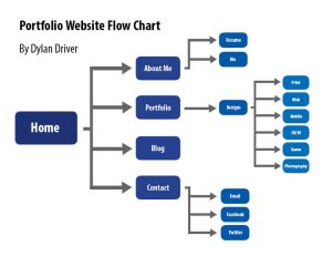
Portfolio Site Flow Chart

The next step in my process is creating my portfolio website. With almost everything else in the identity portion of my portfolio done, this is one of the final (and most difficult) steps in becoming a professional graphic designer.

To decide how my site is going to be laid out, I first had to figure out exactly what was going to go on my site. What content, information, pictures, etc. would go on it? Well, to figure that out, I looked at all of the design related work that I have created over the past few years. I organized it all and checked off which designs would make it, and which just would not make the cut. After this process, I found quite a few designs that would work well for my portfolio. I made sure to choose from the best of the best, and not go with anything that didn’t show off the height of my abilities.

I decided that aside from the obvious home page, I will have an about me page, a page to show off my work, a page that directs you to my blog, and a page displaying my contact information. I felt like this would be an adequate number of sub-pages, considering the amount of content that will be all on one page (the portfolio page). My portfolio will be split into several sections, as the picture will show, including print, UX/UI (web included), mobile, and photography, just to name a few. I have more than enough designs in each of these sections to showcase my abilities, and I think I am heading in the right direction to starting my website.

Flow Chart for my Portfolio Site

Flow Chart for my Portfolio Site

Make My Meal Persona

This past week, I was working on creating a Persona for my new meal app, which I am calling Make My Meal, for the working title at least.

For this persona, I wanted to create the college student that lives a fast-paced lifestyle. This, I believe, would be the top user of an app like this one. I am a college student myself, at the moment, so I know what it is like not wanting to go out for food all the time. There are always times when I look at the food I have in the closet and wonder to myself, “What is something good that I could make out of these few ingredients?” While there are few times when I can actually throw something together using the random food I have on hand, most of the time I just end up going out to eat.

This user is also an experienced user of technology, or specifically iPads. A lot of college students are experienced with iPads and tablets, so I thought this would fit the profile. This type of user would be looking for a quick and easy way to find healthy meals.

On the persona, I posted graphs relating to the user’s personality, usage of iPad apps, and his basic technological skills. I also included a section in which the user would rate, on a 1-5 scale, how often they do certain things or how likely they would be to do certain things if the app were being used. I think that this gives the viewer a good idea of what different things someone would be able to do now that they have this application.

Please check out the persona below!

Persona for Make My Meal

Persona for Make My Meal

Make My Meal – User Research

Over the past few weeks, I have been working on a new application for the iPad.  My original idea was a meal and recipe application that creates meals for the user based on the ingredients that they have on hand.  In other words, the app will make recipes using the food that someone already has in their home.  Have you ever been hungry and cannot think of anything to make at home using the food you already have?  And have you been too lazy to go get more ingredients for a big fancy meal?  Well, if you answered yes to one or both of those questions, this may just be the app for you!

After researching meal and recipe apps, as well as seeing if there are any other apps that do what mine does, my next step was user research.  To begin, I wrote out a series of questions that I would ask several users.  These questions included ones about usage of iPads, meal apps, extra feature ideas, and a lot of questions having to do with food.  I interviewed three people:  my friend Dan, my friend Chris, and my mom, Joanne.  Each of these people owns an iPad and enjoys food, so I knew they would be good interviewees!

During my user research process, I found some interesting data.  I found that although there are many food apps out there, not many people, if any, have used an app that does what I would like mine to do.  I also heard some ideas for new features for the app, many of which I enjoyed.  One of the popular ideas was to have a feature that will create healthier meals for the user.  For instance, if someone is on a diet, they can type in what their ingredients are and how many calories they would like to eat.  The app will mix and match the ingredients, using a database of crowd-sourced data, and create a healthier meal option than it normally would.  This process was definitely useful, as always, in finding out more information about what people like and don’t like in food/recipe apps.

Below is my user data brief that I created after conducting all of my research.  Check it out and see what these users had to say!